✦ What I make · 01
Brand identity design: logos, type and color systems
Brand identity design is the system behind a brand: the logo, the type, the colors and the rules that keep them consistent. Here is the identity work I have made, from a gold aviation monogram to a bold beverage brand, and how each system carried from print to the product page.
Logo design · Typography · Color systems · Brand guidelines · Print design
Selected projects

2023
A total brand reimagination fusing 3D product visualization with a high-energy web experience. Built with custom code interactions and bold aesthetics to capture the brand's expressive personality.
Branding
Web Design
View case study →
2023-2026
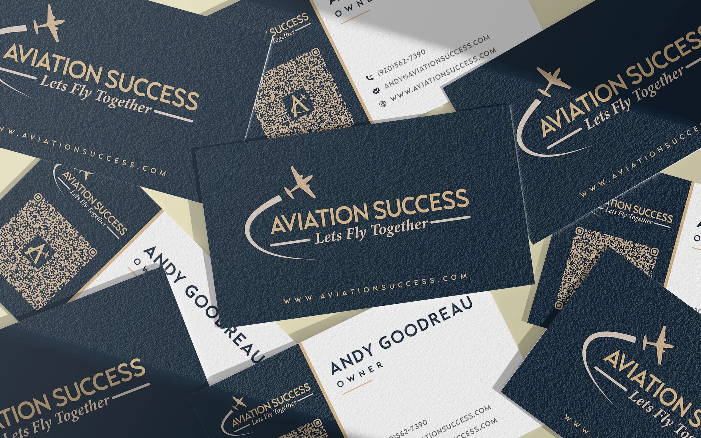
Aviation Success website design, logo and branding by Jeffrey Hakim: a WordPress rebuild, navy and gold identity, print and promo for a pilot training company.
Web Development
Branding
View case study →

2023
Elevating Charleston Elite Detailing’s Digital and Brand Opulence
Logo & Website Development
View case study →

2023
Full Service
View case study →
2021
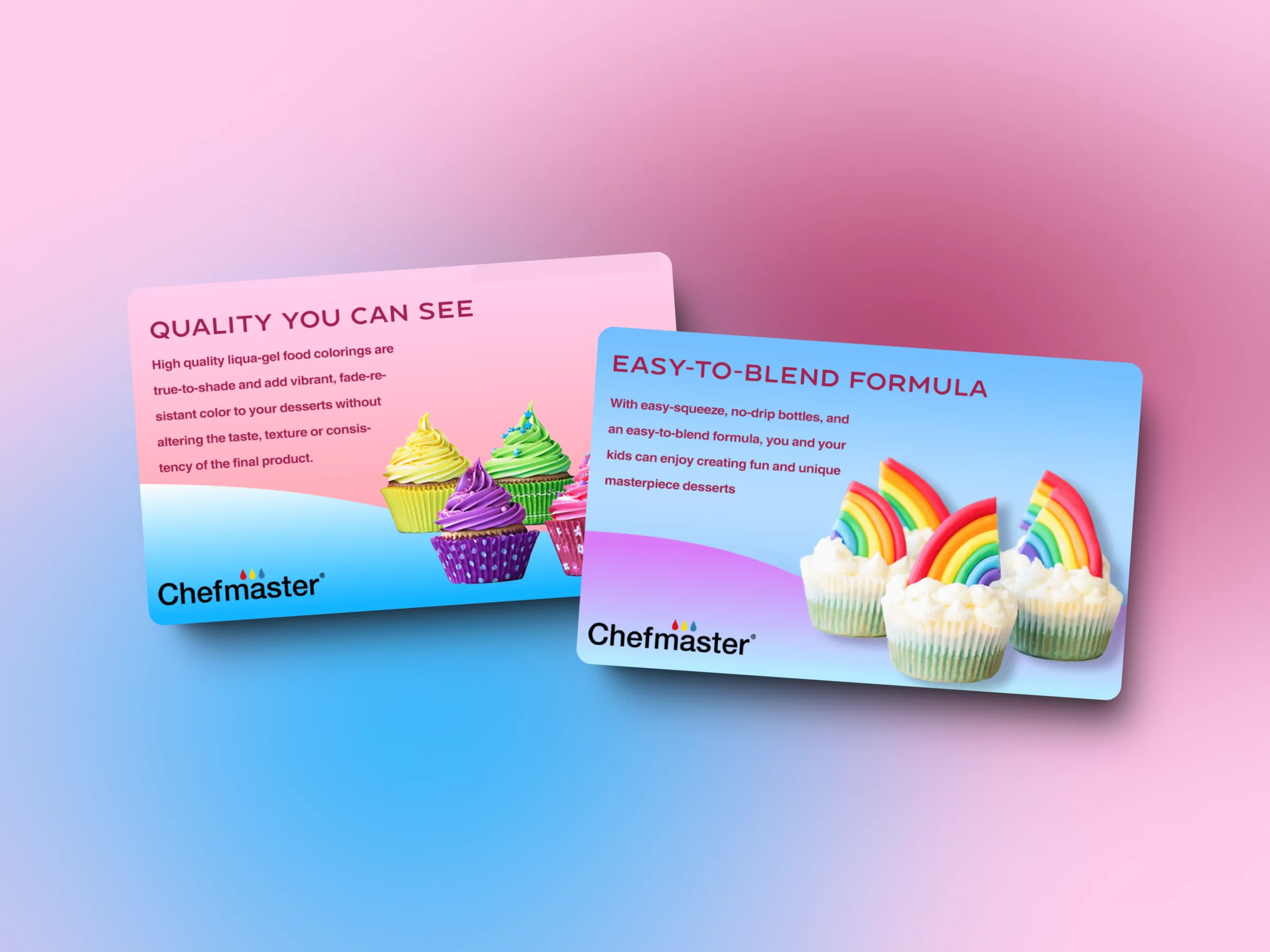
Tasked with revitalizing the product graphics and advertisements for ChefMaster, a leading culinary brand, I embarked on a mission to infuse modernity and clarity into their visual identity. With a focus on simplicity and sophistication, I crafted a series of graphics that captured the essence of ChefMaster's culinary excellence.
Product Assets
Product Design
View case study →
See every project →
✦ How I work
Process and tools
Start with where the brand will live
Before I draw a logo, I list every place the brand will show up: a bottle, a business card, a website header, a product listing. The identity has to read well at each of those sizes.
Build a system, not a single mark
A logo alone is not a brand identity. Each project gets the full set: a primary logo and alternate versions, a type pairing, a color palette and simple rules for using them. For Aviation Success that meant a gold "A" monogram with a small aircraft tracing a contrail through the letter, a horizontal logo and a navy and gold palette.
Carry it into every touchpoint
Then the identity moves into the real work: the website, packaging, print, ads and merchandise. Drink Terpy's logo and slogan were drawn in Illustrator, then carried into 3D product renders and a custom WordPress site, so every touchpoint tells the same story. I wrote more about the Aviation Success system in this case study post.
Tools: Illustrator · Photoshop · Figma · Adobe Substance
✦ More to see
See the rest of my work
Every project has its own case study with the brief, the process and the result. Browse them all, or say hello if something here is useful to you.
View all projects